
A checkout error is not a line of red copy. It is a product state between intent and completion. The customer has already invested attention, entered personal information and decided to buy. If the interface says only “Something went wrong,” clears the form or leaves the payment outcome ambiguous, the design has turned a recoverable condition into a trust problem.
WCAG 2.2 separates responsibilities that are often collapsed into one banner. Error Identification requires the erroneous item and problem to be described in text. Error Suggestion adds a known way to correct it. For financial transactions, Error Prevention requires at least one safeguard such as reversibility, checking with a correction opportunity, or review and confirmation before final submission. Those are different design jobs.
This article analyses a design pattern using current accessibility and payment documentation verified on 29 September 2026. The checkout examples are explicitly hypothetical; they are not results from Noor's store, an A/B test or a client case study.
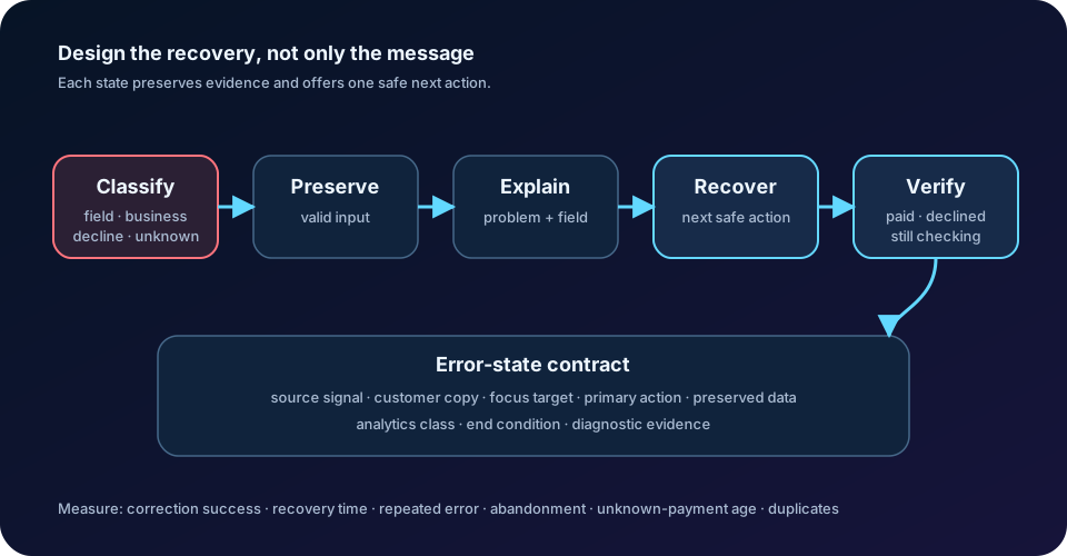
Classify the failure before writing the message
Start with system state, not banner colour. A field error means input is missing, malformed or outside an allowed range. A business conflict means input may be valid but the cart is no longer actionable: stock changed, delivery does not serve the address, or a coupon no longer applies. A payment decline means the provider returned a known result. A transport failure means the request did not complete reliably. An unknown outcome means the customer may have been charged even though the interface received no confirmation.
These states need different recovery actions. A postal-code format can point to one field. A sold-out item needs a cart decision. An expired card can return to payment while preserving shipping information. A network timeout after payment submission must not invite an immediate duplicate attempt; it needs a status check and a clear “confirming your payment” state.
Create an error-state contract before designing screens. For every state, record the source signal, safe customer explanation, affected step, data that remains valid, primary recovery action, alternative action, focus destination, analytics code and the condition that ends the state. Designers, engineers, support and payments teams should review the same contract.
Preserve the work that is still valid
Recovery becomes expensive when one invalid value erases ten valid ones. Keep the cart, address, delivery choice and non-sensitive payment context unless a change actually invalidates them. WCAG 2.2 guidance on Redundant Entry gives checkout as a direct example: after an incorrect card number, submitted information should not be cleared from the form.
Preservation is not the same as retaining every secret. Card-security codes, one-time passwords and provider-hosted sensitive fields may need to be re-entered. Explain that boundary. “For your security, enter the security code again” is different from silently emptying the entire payment step.
On a multi-step checkout, return the customer to the smallest repairable scope. Keep completed steps visibly complete, but let the customer reopen them. If changing the address invalidates shipping cost or delivery promise, mark those downstream values as needing confirmation instead of pretending they remain final. Preserve valid effort and reveal genuine consequences.
Put the error in two useful places
When submission finds field errors, use both a summary at the start of the form section and an inline message beside each affected field. The GOV.UK validation pattern keeps values as entered, moves keyboard focus to the summary and links each summary item to its field. Its Error Summary guidance also calls for summary wording to match the inline wording.
The summary answers “what stopped checkout?” and provides navigation. The inline message answers “what must change here?” Connect it programmatically to the input, set invalid state in semantics as well as colour, and do not rely on an icon or red border alone. Even one error can need a summary for a screen-reader or zoomed-in user who cannot see the field and top of the page together.
After a full-page submission, move focus to the summary. For a dynamically revealed single-field error, keep focus where correction is possible and announce the change. Avoid moving focus unexpectedly while the customer is typing.
Write a recovery instruction, not a diagnosis code
A useful message answers four questions: what happened, where, what the customer can do next, and what the system preserved. “Payment failed” answers only one. “The card expired. Use another card or update the expiry date; your address and delivery choice are saved” makes the path visible.
Prefer specific, neutral language. Do not blame the customer, call input “illegal,” expose an internal provider code, or promise a reason the system does not know. Some declines are intentionally generic for security, so the safe action may be “Try another payment method or contact your bank.”
Keep a separate diagnostic layer for support and engineering: stable error class, provider code, payment-attempt ID, request correlation ID and timestamps. Customer copy is a product decision; the diagnostic record is operational evidence. They can be linked without showing sensitive or confusing internals.
Treat payment outcomes as a state machine
Payment errors are not one category. Stripe's current decline documentation distinguishes issuer declines, blocked payments and invalid API calls, and shows that some responses carry specific reasons such as an incorrect security code or expired card while others should not be retried unchanged. Checkout should translate evidence into allowed customer actions, not render the raw gateway response.
Model at least these states: ready, submitting, requires customer action, repairable decline, use another method, outcome unknown, confirmed and final failure. Disable duplicate submission only while the same attempt is active, and keep an accessible status message explaining what is happening. If outcome is unknown, query the existing payment attempt by stable identity; do not create a second financial intent because the browser timed out.
The difference must be visible. A confirmed decline can offer correction or another method. An unknown outcome should say confirmation is in progress, preserve the order reference, provide a safe status route and explain that the customer should not pay again yet. This protects the customer from duplicate charges and the business from duplicate orders and support cases.
Announce progress without stealing attention
Checkout often changes status without a page reload: delivery rates recalculate, a coupon is accepted, authentication opens, or payment confirmation continues. WCAG's Status Messages guidance requires important non-focus changes to be programmatically available to assistive technology.
Use a polite status region for routine progress and success. Reserve an assertive alert for conditions needing immediate awareness. Do not announce every keystroke or duplicate the same message across live regions. A spinner without text is incomplete; pair it with language such as “Confirming payment—do not close this page.”
If the main button changes from “Place order” to “Processing,” prevent another activation, expose the busy state and offer cancellation only when it is truly safe. A disabled control with no explanation can look broken, especially during slow authentication or network recovery.
Add review where consequences become expensive
Before final financial commitment, let the customer review items, quantities, delivery address, shipping, discounts, taxes, total and payment method. WCAG 2.2 explicitly uses an online order review as an example of error prevention for financial transactions. The review must allow correction, not merely show a frozen receipt before a button.
Do not add confirmation friction to every low-risk choice. Place it where the consequence is difficult to reverse: final purchase, non-refundable booking, subscription term or destructive cart replacement. The goal is not another screen; it is a genuine chance to detect and repair a costly mistake.
When totals change after an address, coupon or delivery edit, announce the change and show why. Keep the final action close to the final amount. A customer should not discover a changed charge only after payment.
Hypothetical example: two errors, one recovery path
Imagine a mobile checkout where the customer submits address and payment together. The postal code is ambiguous, and the selected delivery slot became unavailable while the form was open. This is a hypothetical design example.
The page returns with all entered values preserved. Focus moves to a summary containing two links: “Enter a complete postal code” and “Choose another delivery time.” Each link moves to its control, where the identical inline message appears. The old slot remains visible but unavailable, alternatives show their prices, and changing the slot refreshes the total through an announced status message.
After both repairs, the interface presents a compact review of address, slot and updated total before enabling “Place order.” If payment confirmation then times out, the design switches to outcome unknown; it does not show the form as unpaid or ask for a second card submission. The order reference and “check payment status” action remain available.
This serves the user and business together: less re-entry and ambiguity for the customer, while preventing an invalid delivery promise and duplicate payment attempt for the merchant.
Measure whether customers actually recover
A low raw error count is not necessarily success; validation may be missing or customers may abandon before an error is recorded. Measure error exposure by class, correction success, time from first error to valid submission, repeat submissions with the same error, error-loop depth, abandonment after error, alternative-payment selection and unresolved unknown-payment age. Keep duplicate-charge and duplicate-order incidents as hard guardrails.
Segment by device, locale, direction and browser, plus assistive-technology research cohort where consent and sample size permit. Arabic RTL needs the same focus order, summary links, field association and readable mixed-direction payment strings as English. Do not put addresses, card fragments or free-form customer text in analytics labels.
Combine telemetry with task-based usability testing. Test keyboard and screen-reader navigation, 200% zoom, autofill, copied values with spaces, a slow network, browser back, refresh during submission, stock changes and a payment that succeeds server-side after the client times out. Ask participants what they think happened and what they would do next. If the next action is not predictable, the error state is not finished.
The rule is simple: preserve what remains valid, identify the exact problem, suggest the next safe action, communicate progress accessibly and make the transaction outcome unambiguous. A checkout error succeeds only when the customer can recover without losing trust or creating a second financial risk.
Official references
These references document the tools discussed. Examples and design decisions are illustrative and should be adapted to the project and its versions.
- W3C WAI — WCAG 2.2 Error Identification, verified 29 September 2026
- W3C WAI — WCAG 2.2 Error Suggestion, verified 29 September 2026
- W3C WAI — WCAG 2.2 Error Prevention for financial transactions, verified 29 September 2026
- W3C WAI — WCAG 2.2 Redundant Entry, verified 29 September 2026
- W3C WAI — WCAG 2.2 Status Messages, verified 29 September 2026
- GOV.UK Design System — Recover from validation errors, verified 29 September 2026
- GOV.UK Design System — Error summary, verified 29 September 2026
- Stripe Docs — Payment declines, verified 29 September 2026
Prepared by: Noor Yasser
Working through a similar engineering challenge?
I help teams turn architecture decisions into a clear scope and dependable, reviewable implementation.