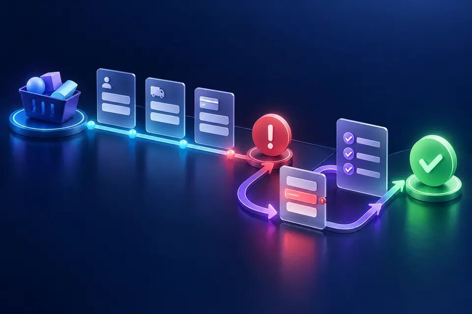
Many products call a sequence of tooltips “onboarding.” The user clicks Next five times, dismisses a celebration screen and lands in an empty workspace without having achieved anything. The product has taught interface geography, but it has not proved value.
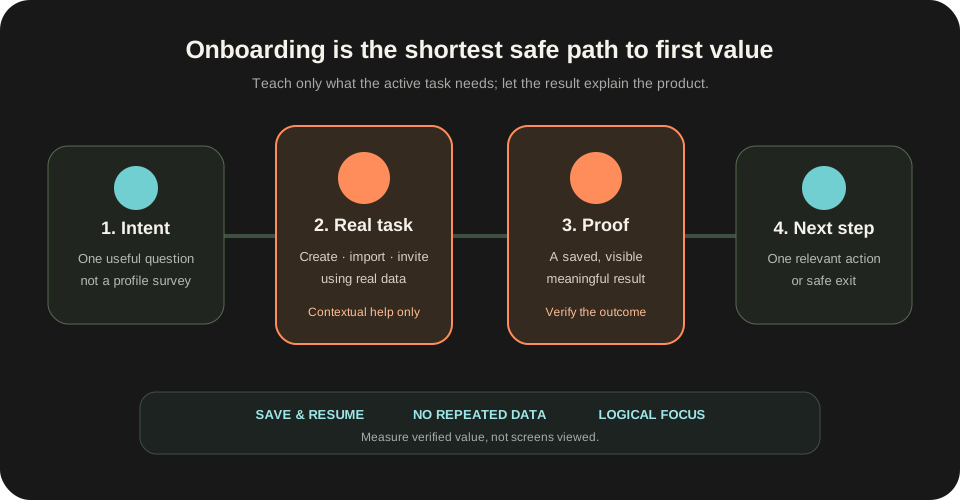
A stronger definition is operational: onboarding is the shortest safe path from a user's intent to a meaningful result they can recognize, keep and continue from. For a merchant tool, that result might be one synced order with a visible reconciliation status. For analytics, it might be one trusted event flowing into a useful report. For collaboration software, it might be a real artifact shared with one teammate.
Nielsen Norman Group's guidance on tutorials versus contextual help argues that people usually do not want to study an application before using it, and recommends revealing help in the context of the current activity. Its guidance on empty states similarly treats a content-less surface as a chance to explain status and provide a direct path to a key task. The design problem is therefore not “How do we explain every feature?” It is “What must the user do and understand to obtain the first trustworthy outcome?”
Define first value as an observable outcome
Do not begin with screens. Begin with a sentence: “The user has received first value when…” Complete it with a result outside the onboarding UI. “Finished the checklist” is not value. “Created a project” may still be only setup. “Imported one real record and verified that it appears correctly” is closer because the user can inspect an outcome.
Choose an activation event that combines action and evidence. A dashboard view alone is weak; the user may be confused. A button click is weak; the operation may fail. Prefer a state such as `report_created` plus `source_connected` plus `result_viewed`, or `invite_sent` plus `teammate_joined` when collaboration is the promise. Not every product can prove value in one session, so distinguish an immediate leading indicator from a later confirmed outcome.
Write the preconditions explicitly. Does the user need data, permission, a teammate, a payment method or an integration credential? If a prerequisite belongs to someone else, onboarding must expose that dependency and offer a useful waiting state. Do not label the user “inactive” when the system is waiting for an administrator.
Create a small first-value contract: persona or intent, starting state, required inputs, meaningful output, evidence, expected time, safe exit and recovery path. Product, design and engineering can then review the same journey instead of optimizing separate screens.
Ask only what changes the path
Early questions should earn their place by changing the next step. A role question is useful only if it selects a different task, default or explanation. Company size, referral source and optional profile details may help sales or segmentation, but they should not block the product outcome unless the answer is genuinely required.
Use branching sparingly. One high-signal choice such as “What are you trying to do first?” can select an appropriate template or workflow. Ten preference questions create work before trust. Provide a recommended default and allow correction later; do not force users to predict advanced configuration before they have seen the product behave.
The GOV.UK question-page pattern recommends asking one question per page when that helps people understand and focus on the answer. That does not mean every onboarding must become a long wizard. Group tightly related low-risk inputs, but separate decisions with different consequences or validation. Progress indicators should reflect meaningful stages, not inflate a three-minute setup into twelve ceremonial steps.
Keep analytics questions out of the critical path where possible. If the product needs a marketing attribution answer, collect it after first value or make it optional and clearly labeled. Onboarding is borrowed attention; spend it on the user's outcome.
Replace the tour with a real task
A forced tour shows controls before the user has a reason to remember them. A real task creates context. Start in the actual product surface with a narrow objective, realistic defaults and a visible result. The user should be able to finish without memorizing labels from a previous overlay.
Use pull and contextual help. Highlight a control only when the task reaches it, explain the consequence beside the decision and leave durable help discoverable later. NN/G's onboarding guidance recommends progressive disclosure: make help available without exposing all detail at once. Its broader progressive-disclosure guidance explains that showing the most important options first helps novice users focus and avoid unnecessary mistakes.
Templates and sample data can reduce blank-page anxiety, but label them honestly. A demo project is not the user's project. Offer a clear transition from example to real data and never mix sample metrics with production metrics. If real data is sensitive or difficult to acquire, use a sandbox that exercises the same decisions and ends with an explicit handoff.
Make skipping safe. The user may already understand the domain or may need to invite a colleague before continuing. “Skip” should preserve the ability to return, not permanently dismiss help. When a tour is truly needed for a novel interaction, keep it short, optional and tied to practice in the interface.
Make progress durable and explainable
Multi-step onboarding is a stateful product flow, not a front-end animation. Store each meaningful task with `not_started`, `in_progress`, `blocked`, `complete` or `needs_review`, plus the evidence that justifies the state. Do not infer completion from a page visit. A connection step is complete when credentials are verified and the first read succeeds, not when the user opens the form.
Save after every valid decision. On return, show what is complete, what remains, why a step is blocked and what can be done now. The GOV.UK task-list guidance recommends task lists only when evidence shows people need control over long, complex services, may complete work across sessions or need to choose order. It also says to simplify the service before adding a task list. A six-step checklist is not automatically better than removing four steps.
Keep system work visible. If an import takes ten minutes, show accepted, processing, failed and ready as distinct states. Let the user leave safely and notify them when the next action is possible. Do not keep a fake progress bar moving while the backend has no durable job state.
Version the flow. If onboarding requirements change, existing users should not be sent backward because a new optional task appeared. Store which contract version the user entered, migrate state deliberately and preserve the outcome already achieved.
Design accessibility and recovery into the path
A modal spotlight that moves focus unpredictably can make a tour unusable by keyboard or assistive technology. W3C's Focus Order guidance requires sequential focus to preserve meaning and operability. Keep DOM order aligned with the visual task, move focus only when the user initiated a context change and provide a way to exit temporary overlays.
Do not ask for the same information twice. W3C's Redundant Entry guidance covers information already supplied in the same process: auto-populate it or let the user select it, except where re-entry is essential or required for security. This matters when onboarding spans organization setup, billing and profile screens.
Validation must keep entered values and place a specific error beside the field plus a summary when useful. After submission, focus should move to an understandable error location without hiding the original context. Network failure must not reset the journey. Keep a local draft where appropriate, persist server-accepted fields and show exactly which action needs retry.
Respect zoom, reduced motion, screen-reader status announcements and touch target size. Decorative animation can reinforce progress, but completion must never depend on watching it. Test the entire first-value path with keyboard only, slow network, expired session, duplicated submission and a small screen—not only the happy desktop route.
Measure transitions, not page views
Instrument the journey as state transitions. Useful events include intent selected, prerequisite missing, first task started, first valid input saved, help opened, validation failed, resumed after leaving, meaningful output created, output viewed, outcome verified and next step chosen. Include flow version and intent, but avoid copying sensitive field values into analytics.
Measure median and distribution of time to first value, not only completion rate. Separate active effort from waiting on system work or another person. Track exits by prerequisite, error type and step. A shorter time is not automatically better if users later undo the result or contact support. Pair speed with output quality, seven-day reuse, successful downstream action and support signals.
Run a funnel by starting state. New empty accounts, invited teammates, migrated customers and users returning after an incomplete attempt should not be mixed. Compare the rate of verified outcomes, not the rate of dismissing the tour.
Use qualitative evidence beside events. Watch representative users attempt the task with their own mental model. Ask them what they expect before a consequential click and what they believe happened afterward. Confident misunderstanding can look like a clean funnel.
Test the path before polishing it
Prototype the first-value contract with the smallest realistic data and system response. Test comprehension of the starting promise, whether users choose the right path, where they hesitate, whether they notice saved progress and whether they can explain the resulting state. Do this before adding illustrations, badges or celebration.
Test variants that remove steps, not only variants that restyle them. Compare a tour with in-context help, a blank workspace with a task-specific empty state, required profile questions with deferred questions and a fixed sequence with a resumable task list. Define the expected decision and guardrail before the experiment.
Include failure sessions in research. Give a participant an expired invitation, a file with one invalid row, a slow import or insufficient permission. The recovery experience is part of onboarding because early failures determine whether the product earns trust.
Before launch, verify four boundaries: product state survives refresh and re-authentication; analytics count a verified outcome once; accessibility works without the visual tour; and a user can leave without losing valid work.
The practical decision
A product tour is content layered over an interface. Onboarding is a product state transition. The difference matters because people do not adopt a product by seeing its controls; they adopt it when the product helps them produce a result they understand and can use.
Define that result, remove questions that do not change the path, begin with one real task, reveal help in context, save every meaningful decision and verify the outcome before calling onboarding complete. Then measure whether the user returns to use that value—not whether they clicked Next.
The best onboarding often feels smaller than the product. It exposes only the decisions required now, proves one promise and leaves the user in a trustworthy state with a clear next step.
Official references
These references document the tools discussed. Examples and design decisions are illustrative and should be adapted to the project and its versions.
- Nielsen Norman Group — Onboarding Tutorials vs. Contextual Help, verified 2 October 2026
- Nielsen Norman Group — Designing Empty States in Complex Applications, verified 2 October 2026
- Nielsen Norman Group — Progressive Disclosure, verified 2 October 2026
- GOV.UK Design System — Task list, verified 2 October 2026
- GOV.UK Design System — Question pages, verified 2 October 2026
- W3C WAI — Understanding WCAG 2.2 Redundant Entry, verified 2 October 2026
- W3C WAI — Understanding WCAG 2.2 Focus Order, verified 2 October 2026
Prepared by: Noor Yasser
Working through a similar engineering challenge?
I help teams turn architecture decisions into a clear scope and dependable, reviewable implementation.