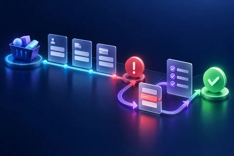
Drag-and-drop can make reordering feel direct: grab a card, move it, release it. But the gesture is not the product task. The task is to change an item's position with confidence. When a gallery, backlog or dashboard exposes only a drag handle, it makes successful use depend on pointer precision, sustained movement and visual feedback that some people cannot operate or perceive reliably.
WCAG 2.2's Dragging Movements criterion does not ban dragging. It requires functionality that uses dragging to also be achievable with a single pointer without a dragging movement, unless dragging is essential or the user agent determines the behavior. That distinction is useful for Product Design: keep the efficient gesture, but design an equivalent action path rather than treating accessibility as a late keyboard patch.
This article analyses a reusable pattern using W3C guidance verified on 30 September 2026. The product-gallery flow below is explicitly hypothetical. It is not an A/B test, client result or claim about Noor's own product.
Define the outcome before the gesture
Write the user outcome as a state change: “Move image C from position 4 to position 1 and make it the cover.” Do not define it as “drag image C to the top.” The first wording leaves room for pointer drag, move buttons, keyboard commands, a position menu or another valid control. The second locks the product requirement to one motor action.
Separate three states that interfaces often blend together: the item that has focus, the item or items selected, and the item's order. Focus tells the user where keyboard input will act. Selection tells the system which object is targeted. Order is persistent product data. A visual card lifting under a pointer is feedback, not the source of truth.
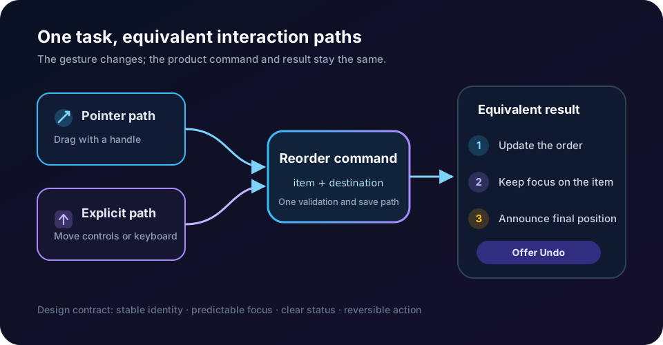
Model the operation as a command with a stable item identity and destination: move(item_id, before_item_id), move(item_id, after_item_id) or set_position(item_id, index). This is an engineering detail with a design consequence: every input method reaches the same operation, so drag and buttons cannot produce different validation, analytics or undo behavior.
Keep drag, add visible move controls
The simplest alternative is often a pair of visible controls: Move up and Move down. For long lists, add Move to start, Move to end or a position chooser when repeated clicks would become burdensome. A product gallery may also expose Make cover as a separate command because cover status is a business meaning, not merely “position one.”
Do not hide the only alternative inside a keyboard shortcut tooltip. A touch user with tremor, a person using voice control, or someone on a zoomed mobile viewport may need the same button path. Controls can appear on card focus, selection or an overflow menu, but their names and availability must remain discoverable. Disabled states should explain the boundary: Move up is unavailable when the item is already first.
WCAG's criterion asks for a single-pointer alternative to dragging. A tap-to-select followed by a tap on a destination can satisfy the motor need, but only if the states are obvious and cancellation is easy. Explicit directional controls are often easier to understand, announce and test.
Preserve focus after every move
After a keyboard or button move, keep focus on the moved item or its corresponding control. If focus jumps to the list start, disappears with the old DOM node, or lands on the next card unpredictably, consecutive moves become a navigation tax.
The W3C rearrangeable listbox example keeps focus on the moved option for repeated operations and exposes action buttons and relevant shortcuts. It also warns that APG examples are illustrative rather than production-ready and must be tested across browser and assistive-technology combinations. Copy the interaction principle, not the example code blindly.
Render lists with stable keys based on item identity, not current index. When the order updates, restore focus to the same item ID and ensure it remains visible. The focus indicator must stay visually distinct from selection, hover and drag-preview states. W3C's keyboard-interface guidance treats persistence and predictability of focus as core interaction concerns, while Focus Appearance provides a measurable baseline for visibility.
Announce the result, not every movement frame
A sighted pointer user sees the card settle into a new position. A screen-reader user needs an equivalent result: “Lamp image moved to position 2 of 6.” Use a polite status region so the confirmation is programmatically available without stealing focus. WCAG's Status Messages guidance says important updates that do not change context should be exposed so assistive technology can announce them.
Announce completed commands, not every pixel crossed during dragging. Continuous live-region output becomes noise and may lag behind the interface. A useful message names the item, final position and total count. If the move is rejected, explain why and keep the item actionable.
Avoid duplicating the same confirmation in several live regions. Reserve assertive alerts for an urgent failure, not routine reordering. If saving is asynchronous, distinguish local order from persistence: “Moved to position 2. Saving…” followed by “Order saved” or a recoverable failure message.
Design reversal as part of the action
Reordering is easy to do accidentally, especially on touch screens where scrolling and dragging compete. An Undo action lowers the cost of experimentation and helps users recover without reconstructing the previous order. It should restore the exact prior state, not approximate the former position after concurrent changes.
Choose when order becomes durable. Immediate persistence can feel responsive but needs debouncing, conflict handling and clear failure recovery. A Save order button creates an explicit commit but introduces a dirty state and a risk of leaving without saving. Either model can work if the status, undo scope and navigation warning match it.
For collaborative products, define conflict behavior. If another person changes the order, do not silently overwrite it. The design may reload the latest order, show a conflict with a comparison, or merge non-overlapping moves. This is not merely backend policy; it determines whether users can trust what the interface says happened.
Hypothetical example: reorder a product gallery
Imagine a merchant editing six product images. The first image is the storefront cover. Each card has a thumbnail, descriptive label, current position and an actions menu. Pointer users can drag with a handle. Selecting a card also reveals Move earlier, Move later, Move to first and Make cover controls. This is a hypothetical design example.
When the merchant moves the lamp image from position 4 to position 2, focus remains on that card. The card's position label updates, the surrounding cards move, and a polite status says “Lamp image moved to position 2 of 6.” An Undo button remains available until the next order-changing command. Making the image the cover is a separate, clearly named action because it changes storefront meaning.
On mobile, the cards do not require a long press that conflicts with scrolling. A tap opens the same move controls in a bottom sheet with the item name in the heading. Voice-control users can target buttons by their visible labels. Keyboard users can traverse the cards and activate the same controls; optional shortcuts accelerate the task but never replace the visible path.
If saving fails, the interface keeps the local order, names the unsaved state and offers Retry or Revert. It does not show a success toast and later snap back without explanation. The command ID and item IDs belong in telemetry, but image names or merchant-entered text should not become uncontrolled analytics labels.
Measure whether the alternative is genuinely usable
Instrument input method only at a privacy-safe category level: pointer drag, explicit control, keyboard command or programmatic action. Measure reorder completion, cancellation, undo use, repeated boundary attempts, save failures, time to a valid final order and abandonment while changes are unsaved. These are diagnostic signals, not universal targets.
Do not call the alternative successful because it exists in the DOM. In usability testing, ask participants to move an item to an exact position, set a cover, undo a mistake and recover from a save failure. Observe whether they can predict focus, understand selection, hear the result and distinguish saved from unsaved order.
Test mouse, touch, keyboard-only operation, screen readers on supported platform combinations, zoom, high-contrast or forced-colors modes, RTL layout and reduced motion. Arabic RTL does not reverse the business meaning of “earlier” and “later” in a vertical rank, but horizontal controls and icons may need locale-specific interpretation. Prefer clear text labels over an arrow whose meaning depends on layout.
Ship a reorder contract, not a drag library
Before implementation, document the ordered data model, item identity, valid destinations, alternative controls, keyboard behavior, focus destination, announcement copy, undo scope, persistence model, conflict behavior, error recovery, analytics and test matrix. Product, Design and Engineering should review the same contract.
The practical rule is straightforward: the gesture can be delightful, but the outcome must not depend on it. Keep drag-and-drop where it helps, expose an equally capable non-drag path, preserve focus, announce results, and let users reverse mistakes. Accessible reordering is not a second-class interface; it is a clearer definition of the product action itself.
Official references
These references document the tools discussed. Examples and design decisions are illustrative and should be adapted to the project and its versions.
- W3C WAI — WCAG 2.2 Dragging Movements, verified 30 September 2026
- W3C WAI — APG Rearrangeable Listbox Example, updated 12 August 2025 and verified 30 September 2026
- W3C WAI — WCAG 2.2 Status Messages, verified 30 September 2026
- W3C WAI — Developing a Keyboard Interface, verified 30 September 2026
- W3C WAI — WCAG 2.2 Focus Appearance, verified 30 September 2026
Prepared by: Noor Yasser
Working through a similar engineering challenge?
I help teams turn architecture decisions into a clear scope and dependable, reviewable implementation.